Efforts to Increase Retention in uMore, Self-Care App
Overview
uMore is a start-up with a mission to make mental well-being more accessible by helping people understand their emotions, track what influences their mood, and take meaningful steps toward positive change.
We aimed to create a product that integrates into daily life, making self-care a natural and consistent habit rather than an occasional effort.
The Challenge
While uMore had a strong activation rate of over 70%, we discovered that retention was weak, with over 80% of users dropping off after the 2nd day. This signalled that while people were interested in the app, they weren’t finding enough ongoing value to make it a lasting part of their self-care routine. Addressing this became a key focus, pushing us to rethink how we could drive long-term engagement and create well-being habits that stick.
The Team
We were a small, fast-moving startup of about 10 people, working in a highly collaborative, agile environment. I recently started as one-half of the design team and felt excited about this opportunity to improve my knowledge on design for retention. This meant learning on the go - diving into research, growth strategies, and behavioural psychology to understand what drives engagement.
Research & Planning
It did not take me long to learn that designing for mental health comes with unique challenges. Unlike other apps, engagement isn’t about entertainment or solving a specific task but it is more influenced by emotions and life circumstances.
Rather than trying to keep people glued to their screens, our focus was on helping users recognize how their thoughts and actions shape their emotions and nudge them towards healthy choices in order to improve their well-being.
The goal was to shift users’ internal compass from “How do I do this?” to “Doing this will help me achieve goals I truly value” or even further into “Doing this is part of who I am”. 🌱
Beyond engagement, we also had to consider ethical, language and data sensitivities - providing guidance without overstepping into therapy or medical advice, avoiding misleading or oversimplified messaging that could create harm, ensuring content didn’t unintentionally trigger any distress and of course making sure we kept data safe and secure.
Since I was still new to retention strategy, I took a structured approach to learning:
Read growth strategy and behavioural change articles to understand retention drivers and human motivation.
Analyzed data with my team to identify engagement features and drop-off points.
Researched competitors to see what worked in similar apps.
Collected user feedback to uncover pain points and needs.
Performed heuristic evaluation to uncover usability issues.
Contributed at creating personas and other ux artefacts to better understand needs and behaviours.
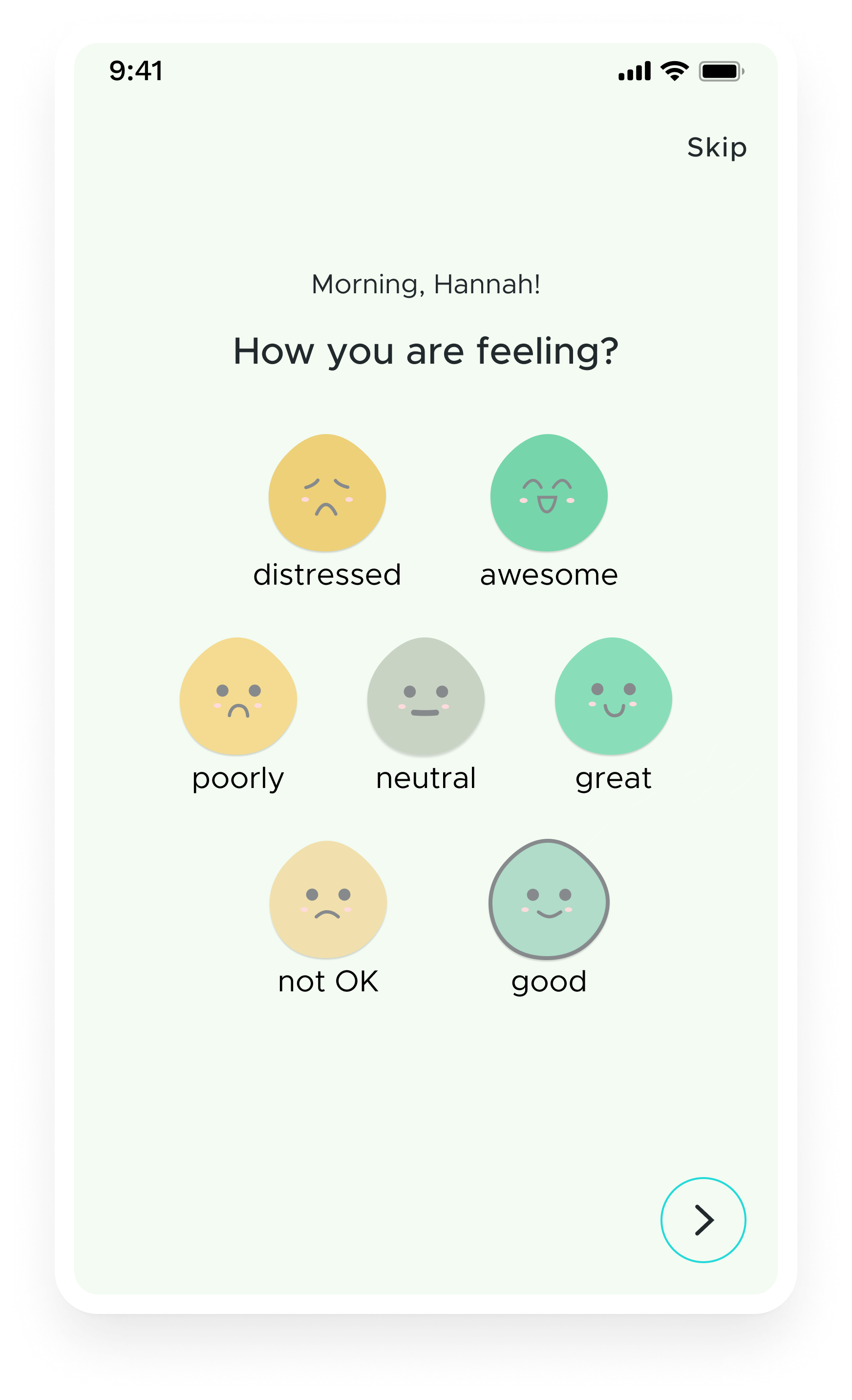
The team had already portrayed 3 types of Personas, and they were: Curious Clare, Help Me Hannah and Quantified Quin. They all initially came with a distinctive set of needs, but after a new round of interviews with existing users, the majority seemed to fit in the “Help Me Hannah” Persona, with a small shift on getting immediate support.
-

“Curious Claire” Persona
-

“Help Me Hannah” Persona
-

“Quantify Quin” Persona
The new “Help Me Now Hannah” Persona
After gathering more user feedback, it seemed that most users now aligned with a more immediate, action-oriented version of Help Me Hannah.
Hanna is a user who seeks quick, effective solutions. She doesn’t have time for exploration or deep analysis, she wants immediate answers, guidance, and results.
Key characteristics:
wants fast answers and clear, actionable steps;
prefers a simple, visual, intuitive experience rather than complex features or insights - minimal cognitive load;
needs constant reassurance that she is making the right choices;
engages with the app primarily when she has a specific need.
Key Problems for Our Challenge
By analysing user data, we noticed:
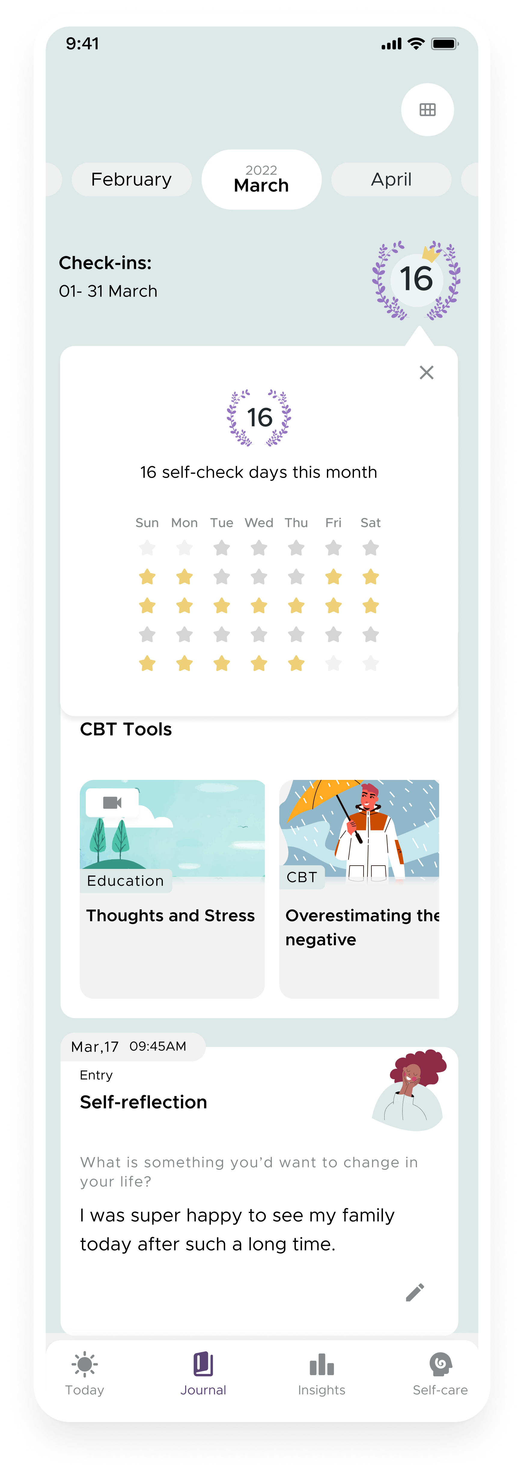
A clear drop in engagement after the second day - While onboarding completion rates were strong, continued usage declined significantly with 70% of user dropping off after day 2. This link has more info about retention standards.
Our most engaged feature was the Mood Check-in but it wasn’t strong enough to keep sustained engagement.
Our psychoeducational content wasn’t performing as expected, with only 3% of users completing the whole route/path of activities, signalling lower than expected retention for structured activities.
Through qualitative research, we identified a few core reasons:
Lack of immediate benefit and unclear next steps - Users didn’t see a clear benefit after logging their mood, and many were unsure how to continue using the app.
Lack of personalisation - There was not enough insight or reward to make people come back for more.
Look and feel of the app - Users reported that the app feels clinical and that the information was difficult to navigate.
To tackle this, we formulated some key hypotheses:
If we provide clear next steps and bite-size activities, users will feel more guided and engaged.
If we introduce personalized recommendations, users will find more value and be more likely to return.
If we make the app feel warmer and more approachable, users will feel more connected and comfortable engaging with the content.
With these in mind, we began exploring solutions—balancing small, iterative tweaks with larger design interventions.
Exploring Solutions
Improving the First Week User Journey
"It is difficult to understand what to do with the app after finishing the onboarding".
One of the first things we looked at was helping users navigate their first few days in the app.
We noticed that after onboarding, users weren’t always sure what to do next. Some explored a few features, while others dropped off entirely. We figured that if we could give them clearer guidance, a sense of progress, and small wins early on, they might feel more motivated to come back.
Research in behavioral psychology suggests that small, early wins increase commitment (foot-in-the-door technique), while choice overload can hinder action. But before structuring this journey, we needed to identify our AHA! moment. Even though conversion metrics showed that the Mood Check-in drove the highest engagement, we suspected this was because it was part of the onboarding flow, not necessarily because it was the most meaningful interaction. Through feedback, we learned that different users valued different features: some preferred Mood Check-ins, others enjoyed Journaling, and some found Activities most useful.
To balance this, we positioned Mood Check-in as the core feature but mapped out other experiences, like Journaling and Activities, across the first few days in a guided checklist.
What we set out to do:
Structure a first-week journey that introduces key features without overwhelming users.
Highlight the Mood Check-in while still allowing users to explore personalized paths.
Provide a clear sense of progress and small wins to encourage retention.
Results & Challenges:
Initially, engagement improved. Users followed the checklist, and those who completed at least three tasks in the first three days were as likely to return the following week. However, some found the structure too rigid—they wanted to explore features at their own pace rather than being guided. We adjusted by adding more flexibility, allowing users to dismiss the checklist should they want to.
Improving the Look and Feel of the App
"I usually know how I am feeling and I don't need the app to tell me that."
One thing that stood out in user feedback was that the app felt too clinical and data-heavy. The well-being test, designed to provide an overall mental health score, was created with standardised measuring tools (PHQ-9, GAD-7, PSS-10), making it highly informative but overwhelming. Users reported that while the insights were helpful, the length of the test discouraged them from completing it, and the results often felt too impersonal.
We had to rethink how the experience felt emotionally. Instead of being a mental health tracker, we wanted the app to feel like a supportive space, insightful but also comforting and reassuring.
What we set out to do:
Reduce the emphasis on the well-being test and integrate it as an optional tool rather than a primary feature.
Redesign the screens to be more inviting and less data-driven, with less text and less cognitive load.
Tidy up the UI style guide to create a more cohesive and predictable experience.
Results & Challenges:
We have A/B tested the solution to validate it before implementation, however, the team was divided on the impact level, so we didn’t allocate a full sprint to complete an integral UI change but made progressive updates instead. This led to inconsistencies, with some screens still feeling clinical while others reflected the new direction. Users noticed, describing the UI as “a mix of different apps.”.
-

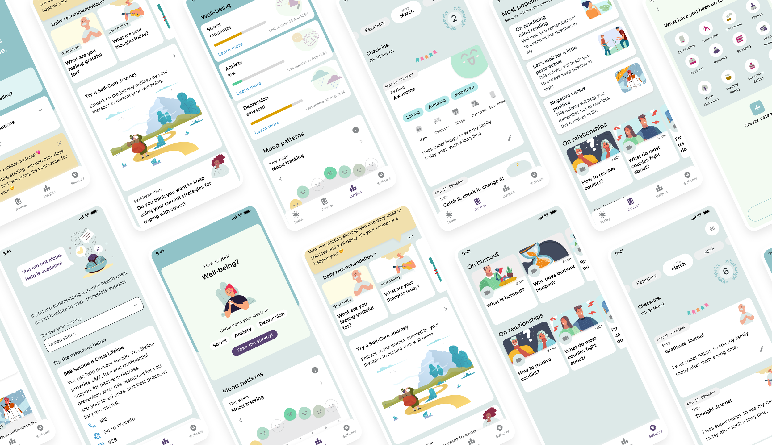
Before: Home Screen
-
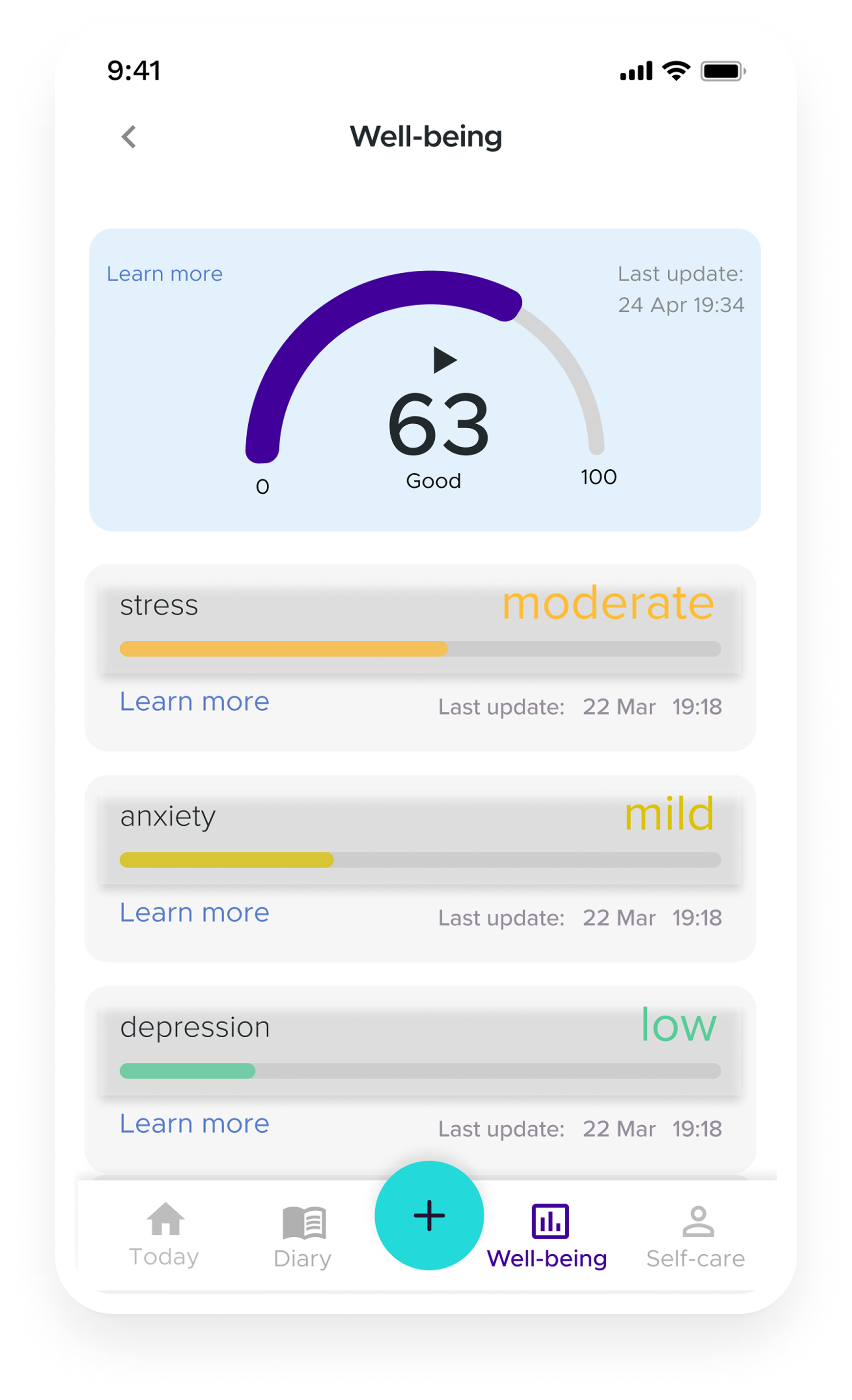
Before: Well-Being Tab showing results from the well-being test. Users had to press on the “learn more” to read the results.
-

After: Home screen - If Mood Check-in was skipped at app open, then it was prompted on the homescreen.
-

After: Home screen at different times of the day, depicted different animation and quote to add calm and newness.
-
After: Well-being tab prompting the well-being survey.
-
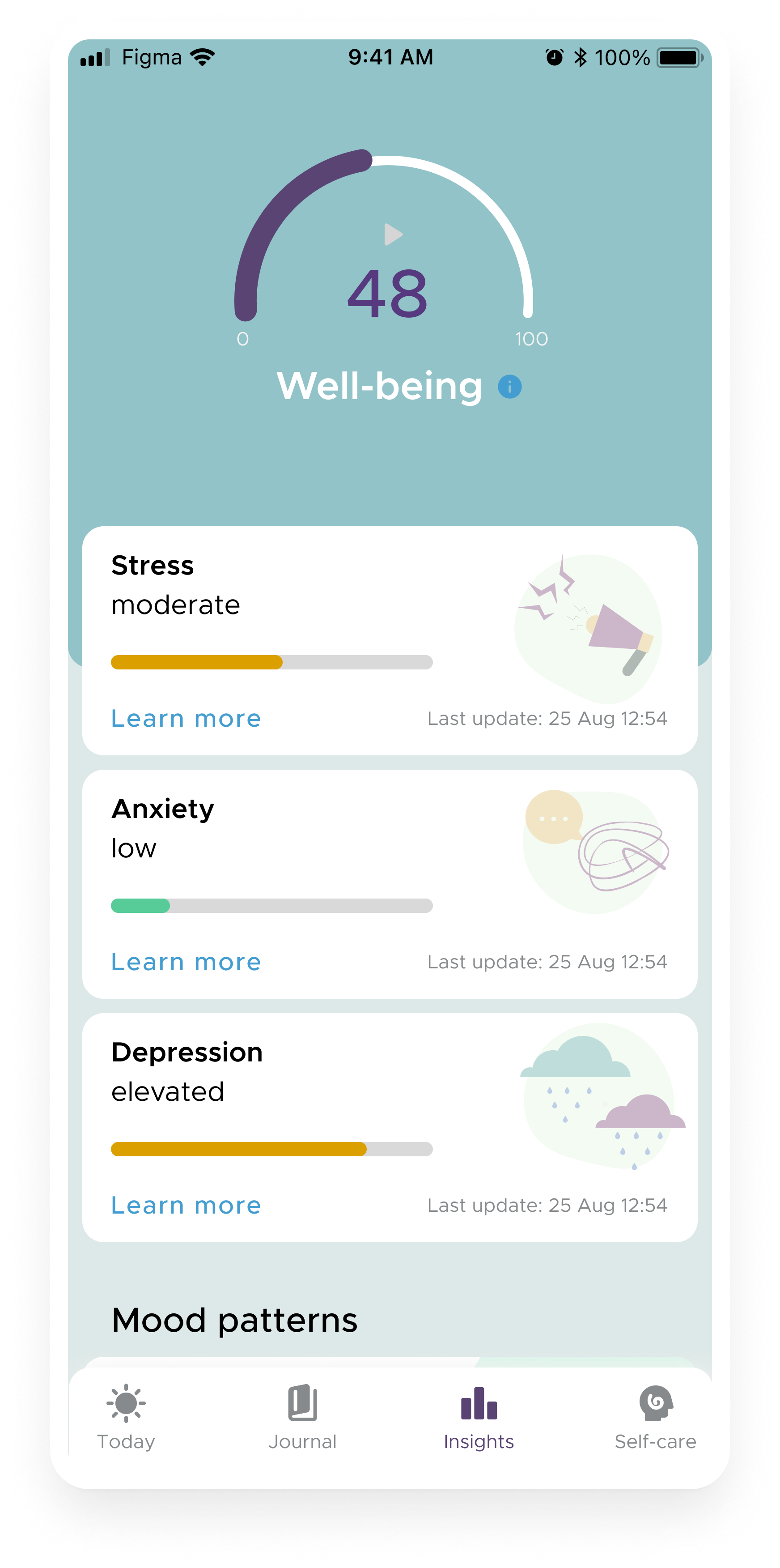
After: Well-being tab showing well-being survey results.
Improving the Psychoeducational Content
"The activities were too much for me, I wanted something lighter. I am not mentally ready for this."
Users found our psychoeducational activities helpful but often overwhelming. The structured learning paths had low completion rates, and many users wanted something they could engage with in smaller, more digestible pieces.
Behavioral design principles emphasize that lowering effort increases follow through (the "friction principle"). Instead of requiring long term commitment, we needed to make activities feel lightweight, flexible, and immediately rewarding.
What we set out to do:
Organize activities into flexible categories rather than rigid paths.
Introduce bite-sized, interactive activities like gratitude exercises and guided journaling.
Diversify content formats by incorporating audio and video for accessibility.
Offer helpers and support on the way to ease the cognitive load of having to complete a new activity from scratch (eg. offer examples or additional guidance)
Results & Challenges:
We created over 50 individual activities, of which about half were CBT/Positive Psychology interactive ones (text based) and the rest were a mix of audio and visual learning and guides. Engagement increased slightly, especially with new video format content, and the favourite new topic became “relationships”.
However, we struggled with how much of our app identity should consist of content, because the competition was already pretty tough in this space, we decided we didn't want to go this route.
Before: Activities were organised as “Paths”
After: Activities showed as “bite-seize” categorised on different topics
Example of CBT Interactive Activity
Example of CBT Interactive Activity
Example of Audio Psychoeducation Activity
Example of Guided Breathing Technique
Improving the Mood Check-in
“If I were given a mood check-in, I would expect to be asked if I have slept, if I had eaten, if I had water.”
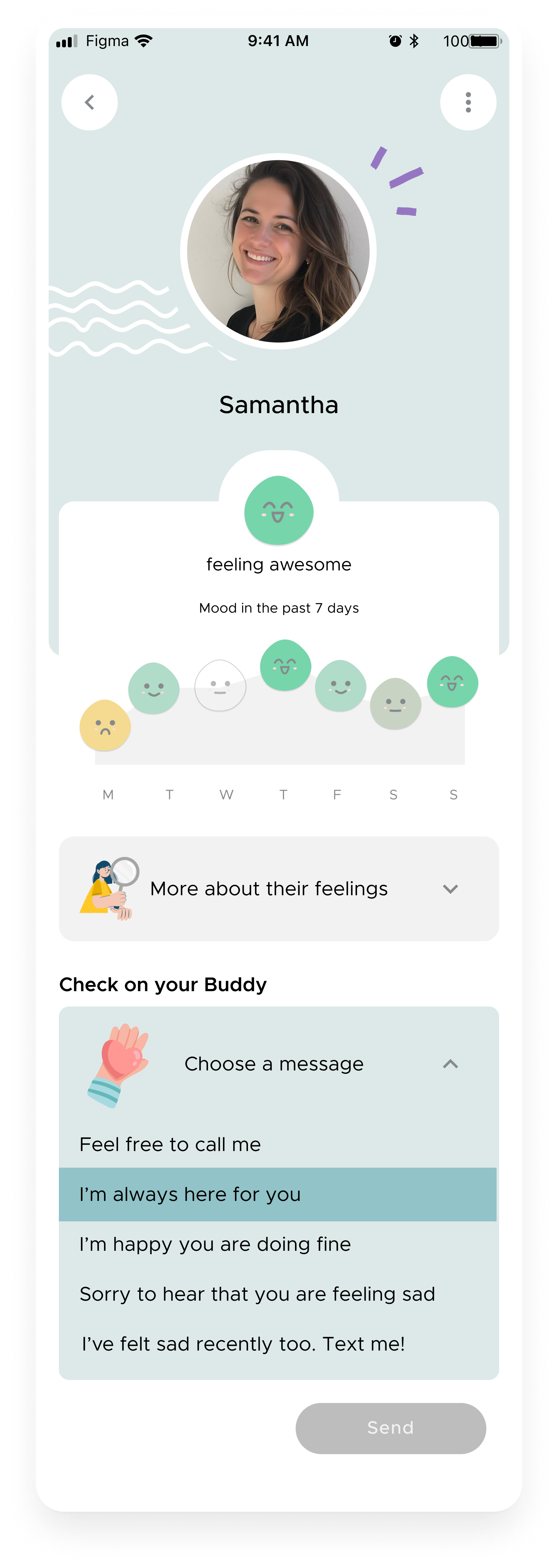
The Mood Check-in remained our best retention predictor, but users wanted it to feel more personal. Some felt limited by the available options and wanted more ways to express themselves. Additionally, after checking in, they didn’t always know what to do next—we needed to give them something actionable.
To address this, we introduced Mood Tips: small, encouraging actions based on their check-in. These ranged from simple habits (“Drink a glass of water”) to emotional nudges (“Send a kind message to someone you value”).
What we set out to do:
Expand the Mood Check-in to include more options that reflect diverse lifestyles and emotional states, and customization.
Introduce Mood Tips as small, actionable suggestions tailored to the user’s mood.
Add different widgets to track mood trends over time, helping users see progress and understand how they feel in a personalized way.
Results & Challenges:
Users loved the added depth to the Mood Check-in, and many reported that Mood Tips provided a small but meaningful boost. Not all the widgets had the same performance. While the Mood Tips were quite successful, the other widgets were perceived as simplistic or reductionist to people’s real feelings. The feedback made sense as we needed to gather long-term data to be able to perfect the correlations between mood and other behaviours and provide useful insights.
-
Mood Check-in step 1: picking an emoji representing your mood
-
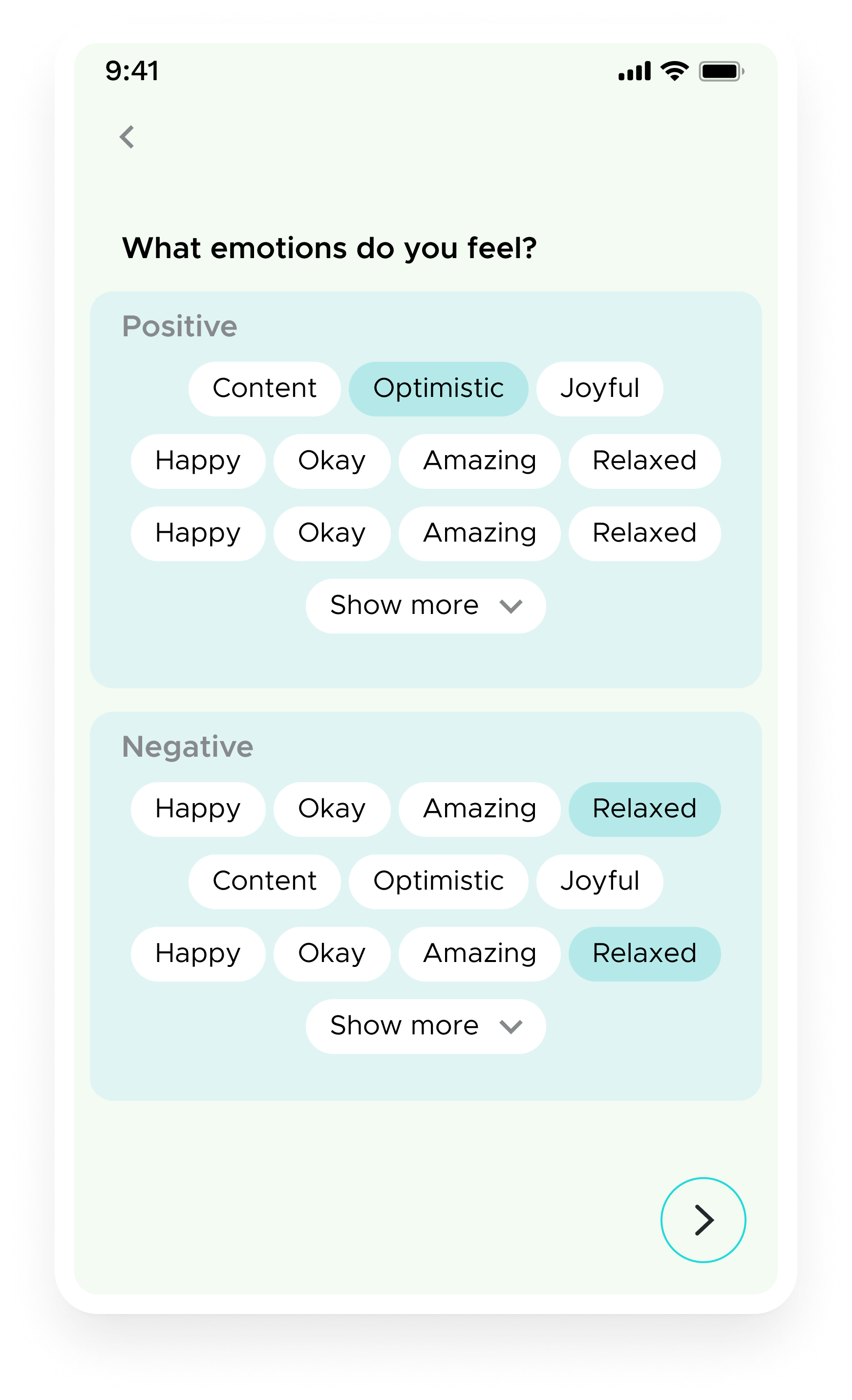
Mood Check-in step 2: picking emotions
-
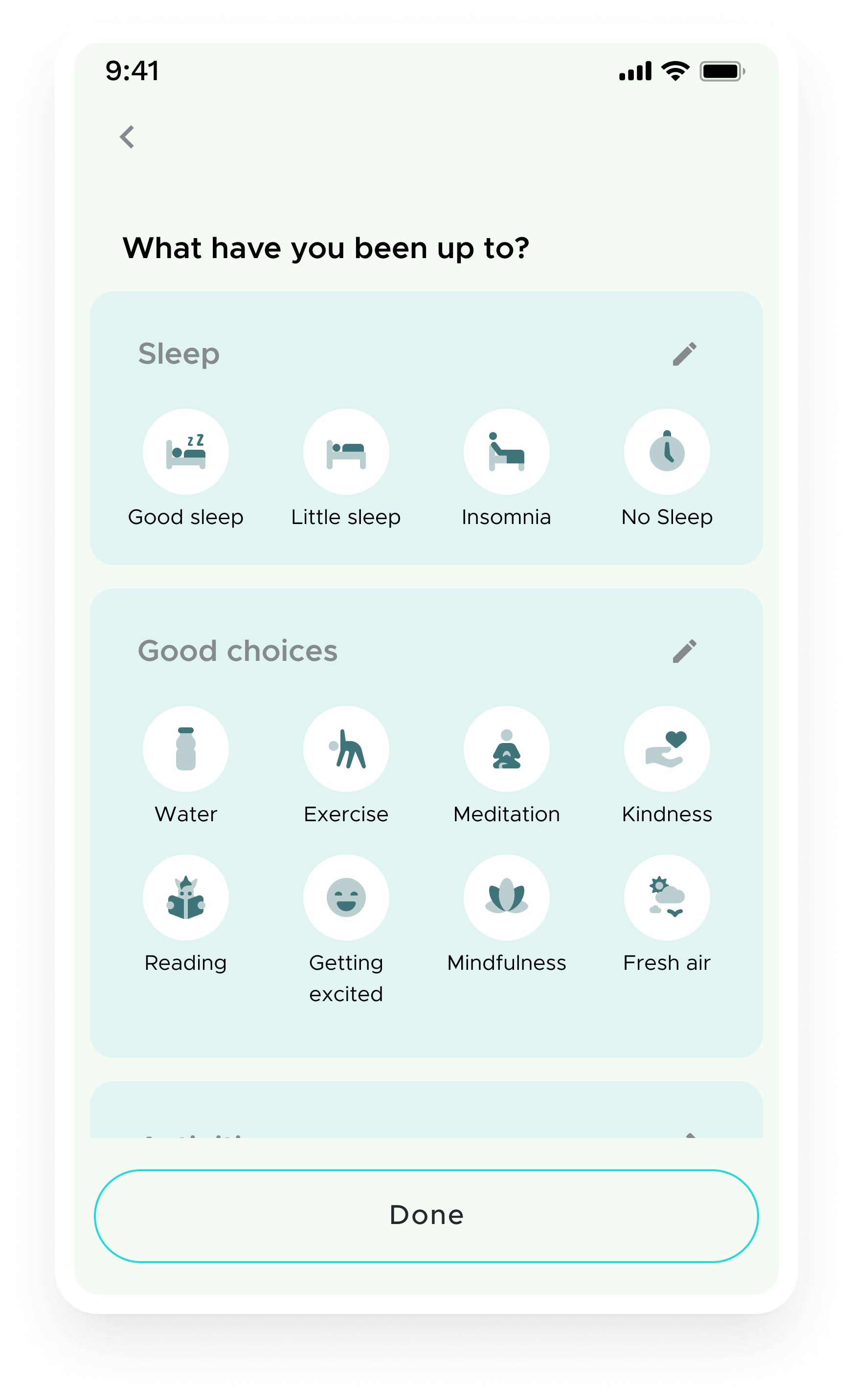
Mood Check-in step 3 : picking related behavioural context
-

Mood Check-in Customisation: Users could create their own categories, re-arrange items within a category
-
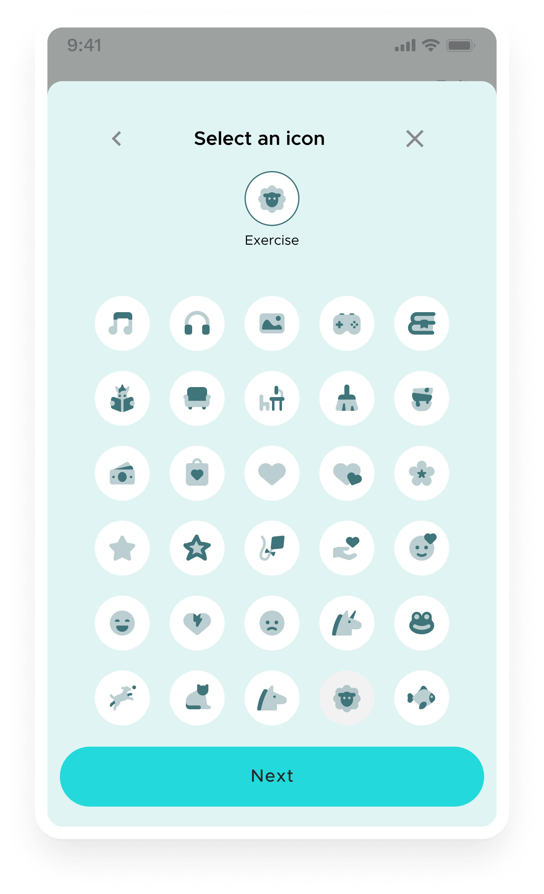
Mood Check-in Customisation: Users could select and name their own context actions
-
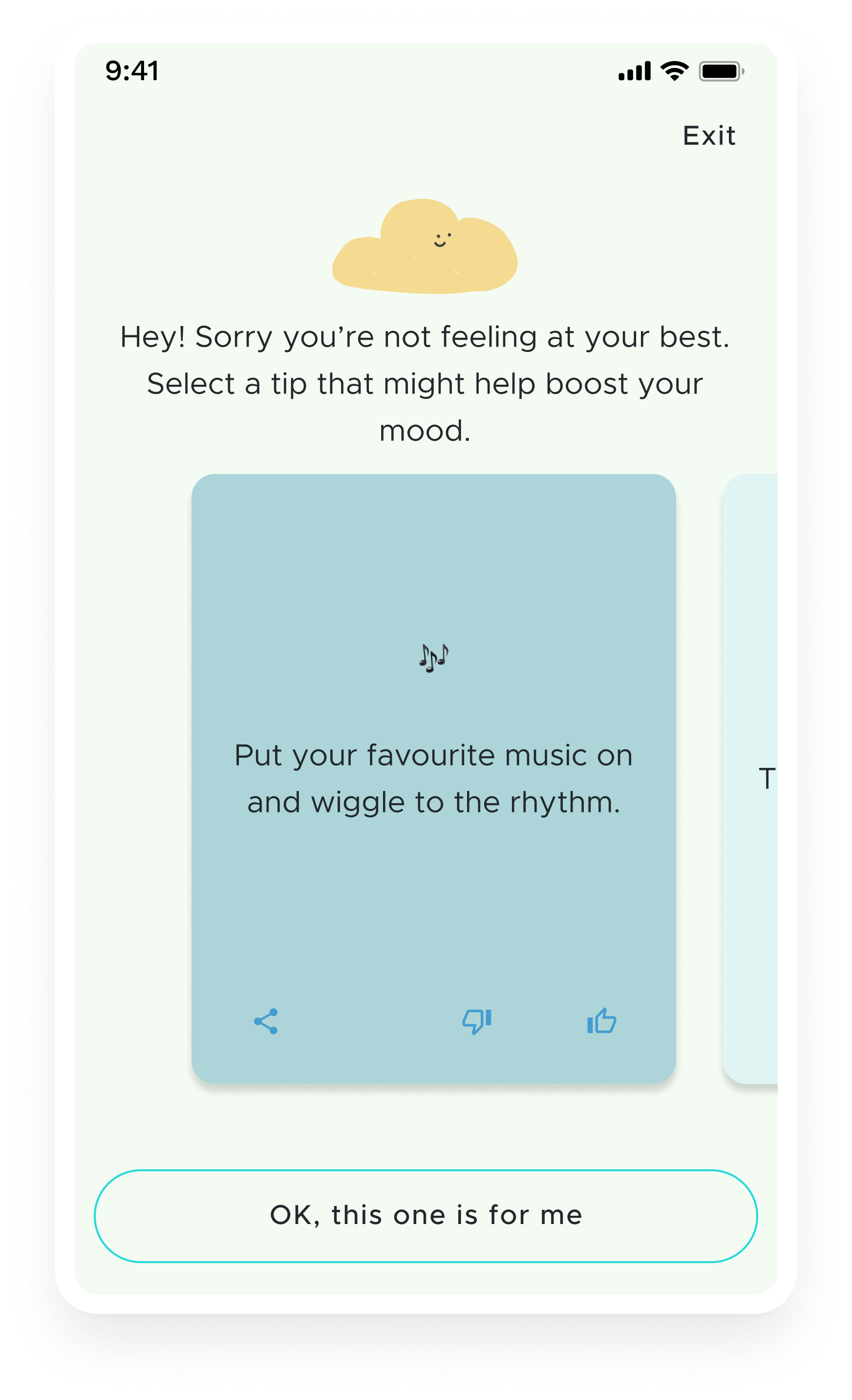
Mood Check-in Follow-Up: Providing Users with “Mood Tips” - actionable little steps they could take to boost their mood.
-
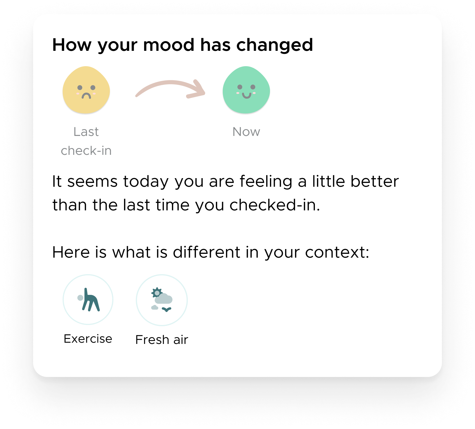
Mood Widget: Showing mood changes from the previous check-in.
-
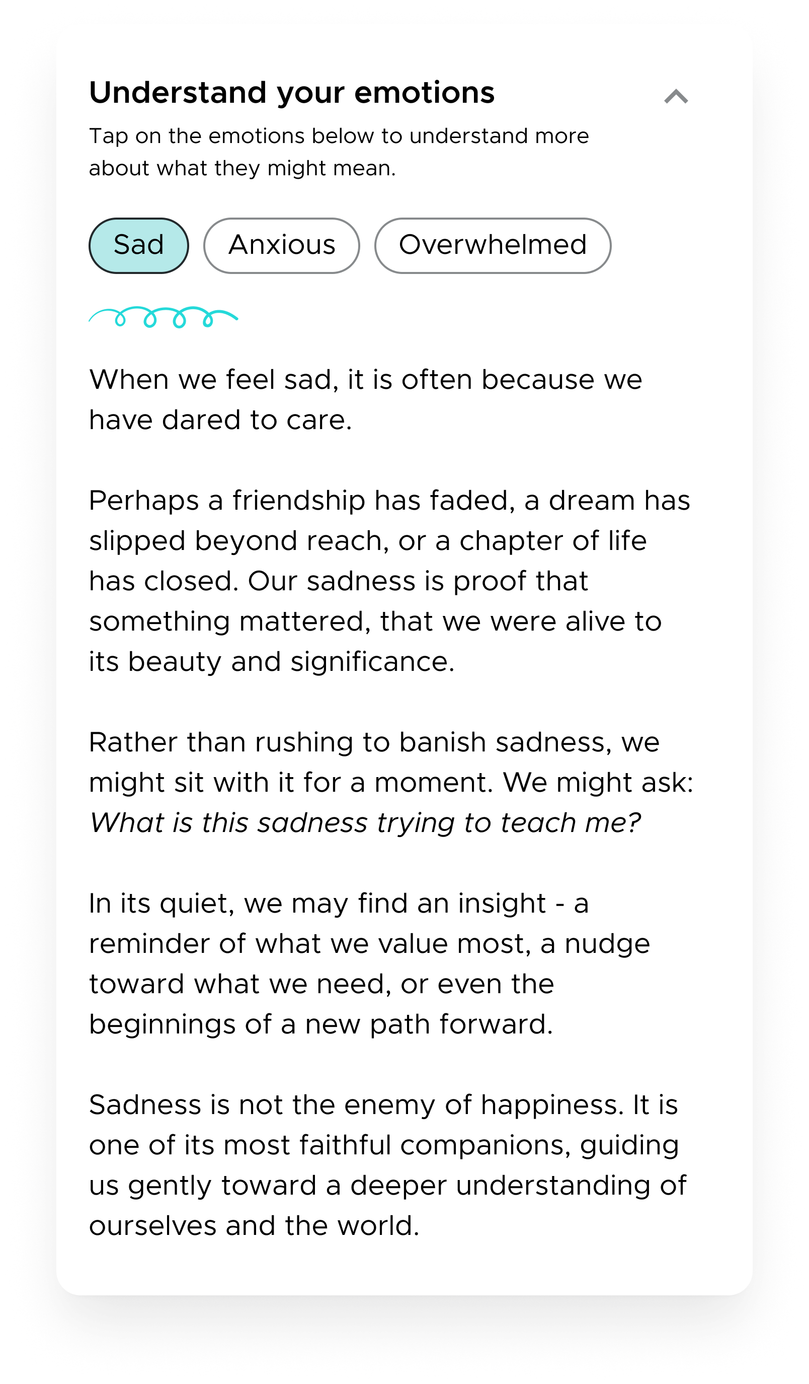
Mood Widget: Offering a reassuring interpretation of one’s feelings selected during the check-in.
-

Mood Widget: Showing a weekly cloud of average moods and most selected emotions.
-
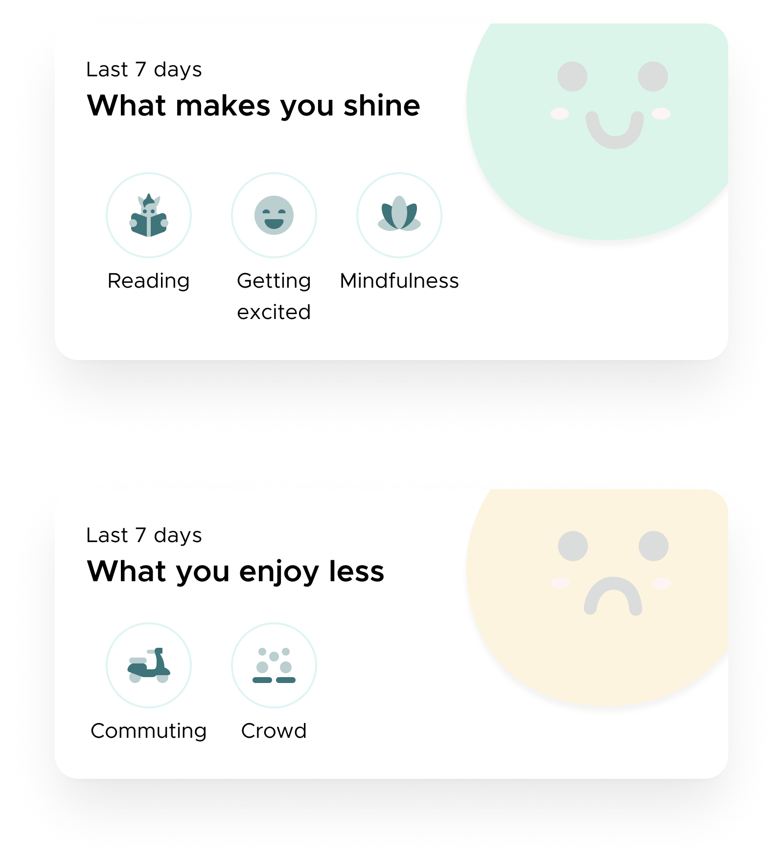
Mood Widgets: Showing what contet actions are usually associated with positive and with negative mood.
-
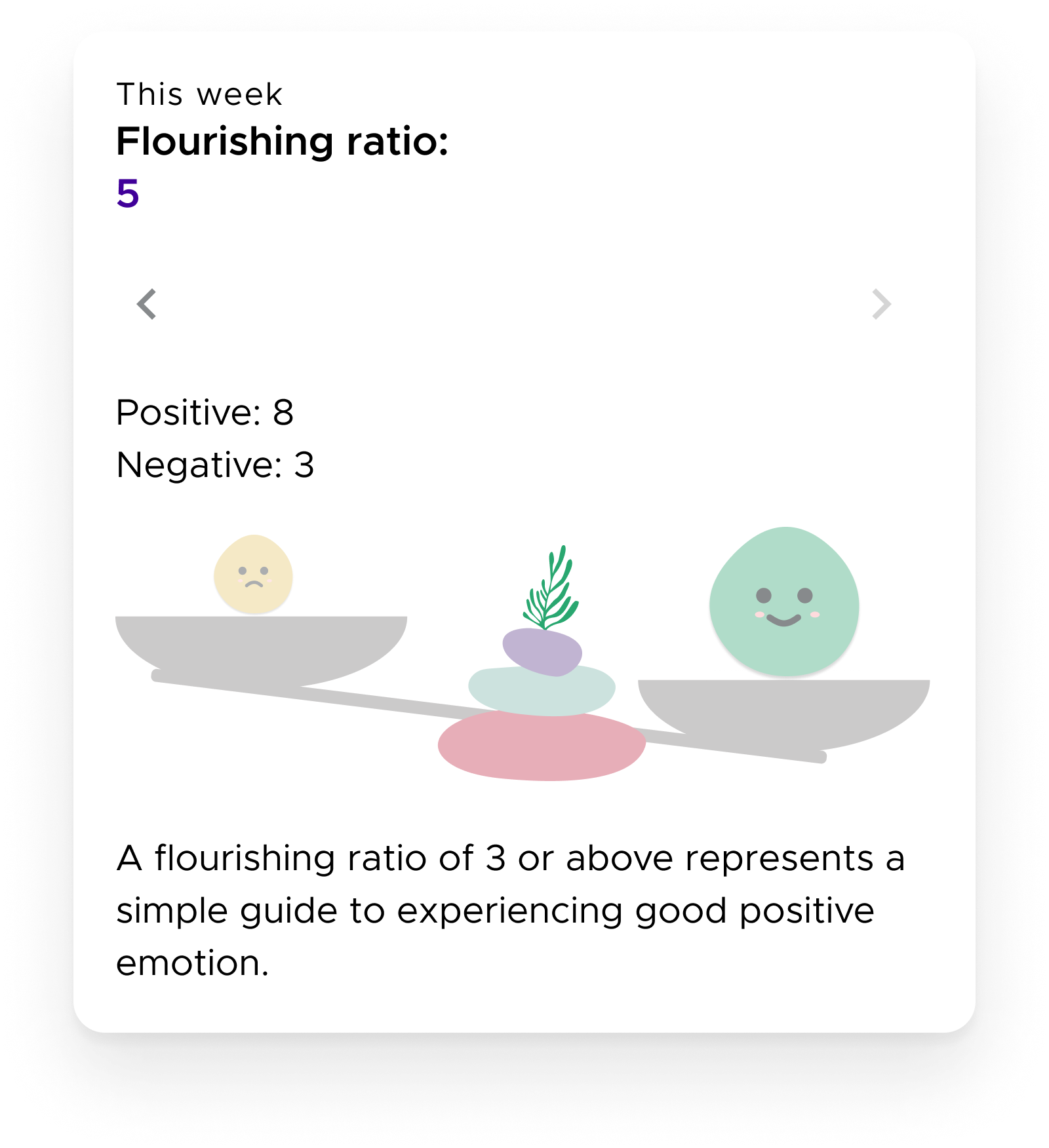
Mood Widget: Showing a flourishing ratio (a number representing the ratio between positive and negative moods)
-
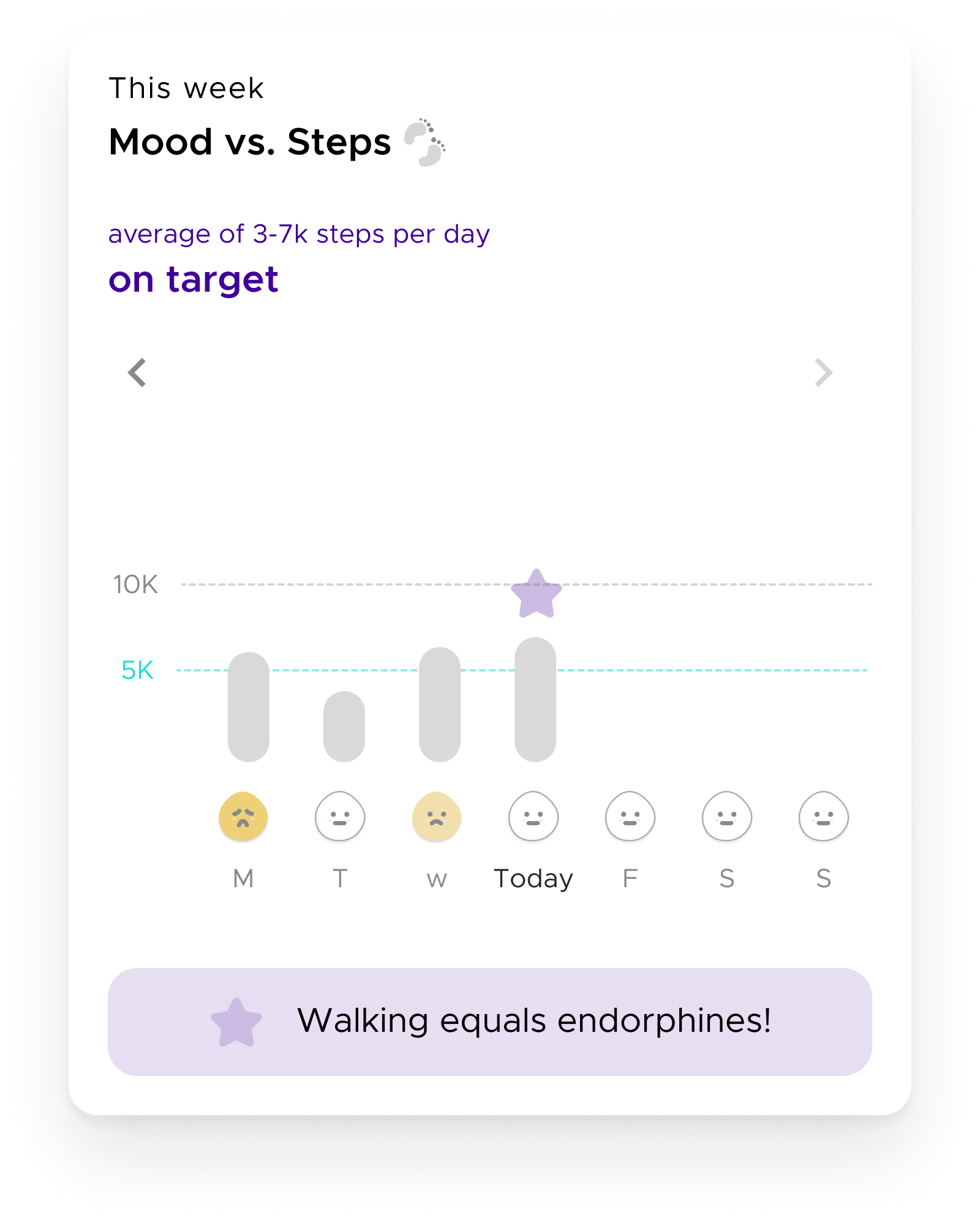
Mood Widget: Mood vs. Steps - we have implemented integration with Google Fit and Apple Health to show the relation between physical activity and mood.
Strengthening Retention through Commitment
According to Sarah Tavel’s retention framework, an app becomes more valuable as users add more of their data. Over time, the environment becomes more personal, and it might create a sense of loss if they stop using it.
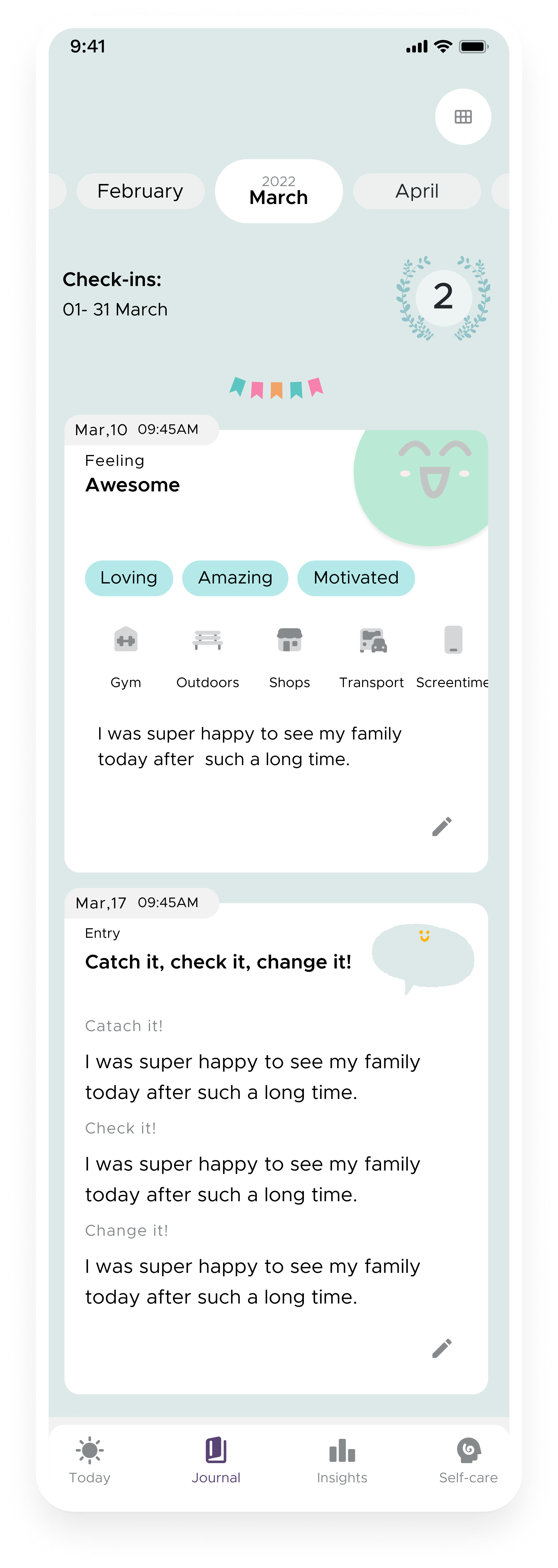
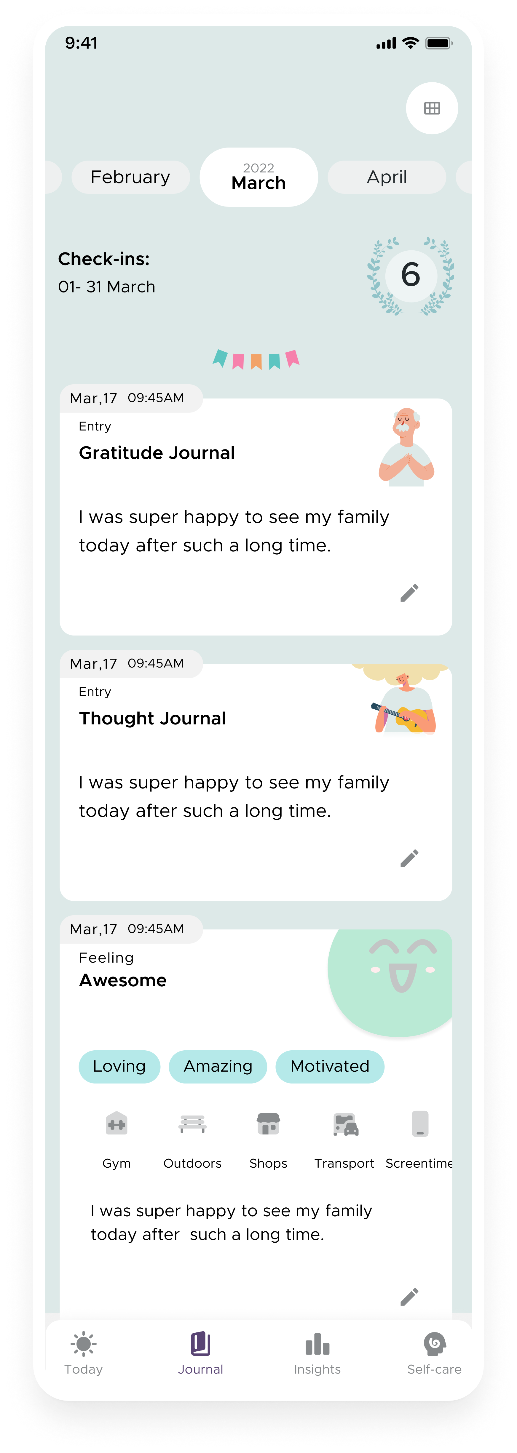
With this in mind, we focused on making the "Diary" section more inviting, so users could find delight in looking back and reflecting on their progress. But we knew we also herd constant feedback that the app is lacking human connection so we thought it would be a good idea to give users the option to invite a small circle of trusted people to the app.
What we set out to do:
Make the Diary more rewarding by surfacing meaningful trends and insights.
Test social accountability features like the "Buddy" system to increase engagement.
Results & Challenges:
The Journal tab resonated with long-term users, reinforcing habit formation. However, the Buddy feature saw low adoption—users didn’t want to feel like a burden for their loved ones and so avoided inviting them to the app, and many preferred a more private experience. This highlighted an important distinction: while social motivation works well for fitness and productivity apps, mental well-being is often a more introspective and personal journey.
-
What should we know about the services you provide? Better descriptions result in more sales.
-
What should we know about the services you provide? Better descriptions result in more sales.
-
What should we know about the services you provide? Better descriptions result in more sales.
-

What should we know about the services you provide? Better descriptions result in more sales.
-
 Description goes here
KeyTakeaways
This project taught me that designing for mental health is far more complex than simply applying best practices from other digital products. Above, I presented the main things we tried but in reality, we did a lot more iteration and testing; still, the real well-being impact remains unknown.
We often assume that if we provide value, users will keep coming back, but motivation fluctuates based on everybody’s circumstances - someone eager to engage today might feel emotionally drained tomorrow. Traditional app metrics like daily active users or retention rates may not explain a feature’s value or the real well-being impact.
Another recurring theme in user feedback was the lack of human connection. Even though we tried to resolve this through the “Buddy” feature, it seems that users don’t want to feel perceived as a burden for their loved ones. This makes me think that sometimes technology alone isn’t enough and that apps can not replace human support - they might need to be embedded within a larger support system of real-world connections.
To conclude, it seems that mental health improvement is slow, nonlinear and personal. Change doesn’t happen overnight, and the most we can hope for is that we have planted some seeds of change that some day, under the right conditions, might be able to grow further.
Note: I used AI to help organise and polish the writing in this case study. The research work, thinking, and decisions are entirely mine.