Rebuilding The Village: a Space for Mums to Belong

Overview
Momsi is a mobile app designed to connect new mums with local support, shared wisdom, and emotional reassurance. The idea emerged from the founder’s own experience after the birth of his child. He and his wife realised how difficult it was to navigate early motherhood without a support network. They wanted to create a space where mothers could find community, speak openly, and access helpful resources—all in one place.
I joined the team as the UX designer, fresh out of a UX bootcamp. As a mum myself, living abroad and adjusting to a new baby, I deeply resonated with the mission. I had felt the same isolation, confusion, and longing for connection. It felt like a beautiful opportunity to bring that shared experience into a meaningful design.
The Problem
Motherhood is often idealised as intuitive and joyful, but the reality can be overwhelming, especially in the early months. Many mums face emotional and practical struggles in silence. This insight sparked the idea for Momsi - a space designed specifically for mums to connect, share, and support each other without pressure or judgment. The goal was to create a more meaningful alternative to traditional social platforms, grounded in empathy and real-life connection.
My Role
I was part of a small team of three, with the goal of designing the product before handing it off to a development agency for implementation. The team included:
Ionuț Turlea – Founder
Irina Ianculescu – Marketing & Growth
Myself – UX Design
As the sole designer, I was responsible for shaping the entire product experience — from early brand exploration to final design handoff. My contributions included:
Developed the app’s visual identity
Designed the user flows, navigation, and wireframes
Conducted usability testing with mums in Romania
Collaborated closely with the team to ensure feasibility
Delivered High Fidelity Designs
Understanding Our User

When I joined the project, initial research had already been completed, and Ionut had outlined a long list of features and ideas to explore. To ground the design process in empathy and stay focused on real user needs, I created a persona representing our target audience — mums in the early stages of motherhood.
This persona helped capture their day-to-day emotional and functional challenges and became a reference point for making thoughtful design decisions throughout the project.
👩🍼 Ana, First-Time Mum
Age: 32
Location: Bucharest, Romania
Family: Married, one 6-month-old baby
Occupation: On maternity leave from her marketing job
Mindset & Emotions
Ana is caught in a whirlwind of love, anxiety, and exhaustion. She misses her pre-baby life, struggles to feel competent, and feels isolated even when surrounded by others.
Needs
To feel normal in her struggles
A place to share vulnerable feelings anonymously
Support in rebuilding her identity as a mother and a woman
Pain Points
She’s sleep-deprived, foggy, and often feels she's not doing enough
Her relationship with her partner feels strained
Her previous friendships seem to fade
Returning to work feels uncertain and far away
Goals
Meet local mums who understand
Access advice without being overwhelmed
Carve out guilt-free time for herself
Tech Habits
Uses Facebook but finds it too noisy
Craves something focused, calm, and honest
Competitor Analysis
To better understand the landscape, I conducted a quick competitor analysis of digital platforms for mums. I focused primarily on Facebook Groups, which are widely used in Romania and serve as the default go-to app for many mums seeking support. I also reviewed apps like Peanut, Mush, and WeMoms — while not available for download locally, they offered valuable insights and inspiration.
Facebook Groups are deeply embedded in Romanian users’ routines, but they come with some drawbacks: they lack emotional safety, conversations get easily buried, and the experience often feels impersonal. There’s little transparency about who sees your posts, and the structure doesn't support building a close-knit, local community — something we felt was essential for new mums looking for connection and reassurance.

Feature Definition, User Stories, Core Journeys
Ionut brought a long list of feature ideas, many of which were supported by the initial research. Building on that, I focused on shaping a core set of features that aligned with the everyday needs of new mums. I wrote user stories to help frame each feature in the context of real-life situations, making sure our decisions stayed grounded in empathy.
The intention wasn’t to create just another app, but to explore how a digital space could gently encourage real-world connection — moments of generosity, local meet-ups, and emotional support. We hoped the experience would feel less like a product and more like a quiet companion for mums navigating early motherhood.
Each journey was grounded in a clear user goal. These were the key flows we mapped:
Create Local Village
“I want to find mums nearby I can actually meet.”
A location-based feature that surfaces mums within walking distance — not just static profiles, but invitations to real-life connection.Community Forum
“I need to talk to someone who gets it.”
A space for honesty. Anonymity optional. Women only for privacy and safety.Profile Pages
“Where is the me that I know?”
Imperfect, human. More than a username: a space to show who you are, what you need, and what you can offer.Marketplace
“We’re drowning in stuff — someone else could use this.”
A circular economy for baby items. Less waste, more generosity. A swap/sell/share system designed with safety and ease in mind.Expert Services
“I need real help, not just opinions.”
Curated access to qualified professionals, from lactation consultants to perinatal therapists. Integrated booking and filtering.Events
“I want to meet other mums — but I don’t know where to start.”
A calendar of online and offline events to re-humanise digital connection and reduce the barrier to showing up. Anyone can initiate meet-ups.
With so many features to consider, structuring the information architecture was a challenge. I needed to work within the constraints of a 5-tab bottom navigation, and find a balance between what would be most helpful for mums and what made sense from a business perspective — all while aiming for a navigation that felt simple and intuitive.
My goal was to keep key actions easy to access, using clear, familiar language that reflected how mums naturally speak and think.
I started by drafting the IA based on my own judgment and understanding of the users. To test these early assumptions, I ran an open card sorting exercise, which offered valuable insight into how users grouped tasks and understood different labels. It also helped surface subtle differences in how terms like “support” or “services” were perceived — small but meaningful distinctions that helped guide the structure.


To ensure alignment with the team, I created quick paper wireframes to communicate my design ideas and make sure they were in line with the founder’s vision. As more questions arose and we identified opportunities for improvement, we worked together to refine the design across a few versions. Mapping out the experience helped us revisit the user stories and prioritize features that would best meet the needs of mums, while also staying focused on our goals.


Visual Branding and Style Guide
As we moved into high-fidelity designs, we focused on creating an app that felt welcoming, uplifting, colorful and bold, without relying on typical “baby” pastel shades. Our design choices included:
Warm tones and bold accents - to bring warmth and a sense of empowerment
Typography - clear and easy to read, even with tired eyes
Logo and iconography - soft shapes and fluid lines to feel supportive and comforting. My talented friend, Iulia Jurca stepped in to help design some beautiful custom icons to help give the app a unique feel.
The idea behind the brand was simple: We’re here for the messy process, and you’re not alone. Find others to share the journey.
Once we had the team aligned, I created a minimal style guide to help maintain consistency as the design developed.


Early Testing & Feedback
For our first round of testing, we created an interactive prototype and shared it with an engaged Facebook group of mums. Their insight was invaluable—they helped us validate core navigation decisions, prioritize what content should be surfaced, and highlight the features that needed more clarity.
We focused primarily on the initial layout, main navigation, and how information was structured. Our goal was to see if users could easily understand where to find what they needed and how to complete basic tasks like creating a post.
Key Learnings:
Initially, anonymous posts were hidden within the navigation, and mums didn’t understand why they were in a separate section. This made us rethink the structure - why separate anonymous posts and help requests from the message feed? We merged anonymous posts and help requests into a single feed and renamed it “SOS” to easily mark posts that need immediate attention.
The early design looked too overcrowded and lacked warmth. It didn’t feel like a space that welcomed mums or reflected their emotional world. so we re-designed the layout, adding imagery that sparked tenderness and familiarity. This small shift brought a surprising amount of emotional delight.
While we had originally planned to include expert-led content and features, we realised early on that we wouldn’t have enough traction to support it meaningfully.
We decided to pause this feature and focus on building strong community connections first.
This group of mums helped shape everything from full flows to copy tweaks. They were quick to respond, generous with their time, and their enthusiasm made us want to fast-track the launch, so they could finally have the village they were promised.


Back to mapping flows in detail
-
![]()
Onboarding Flow
-
![]()
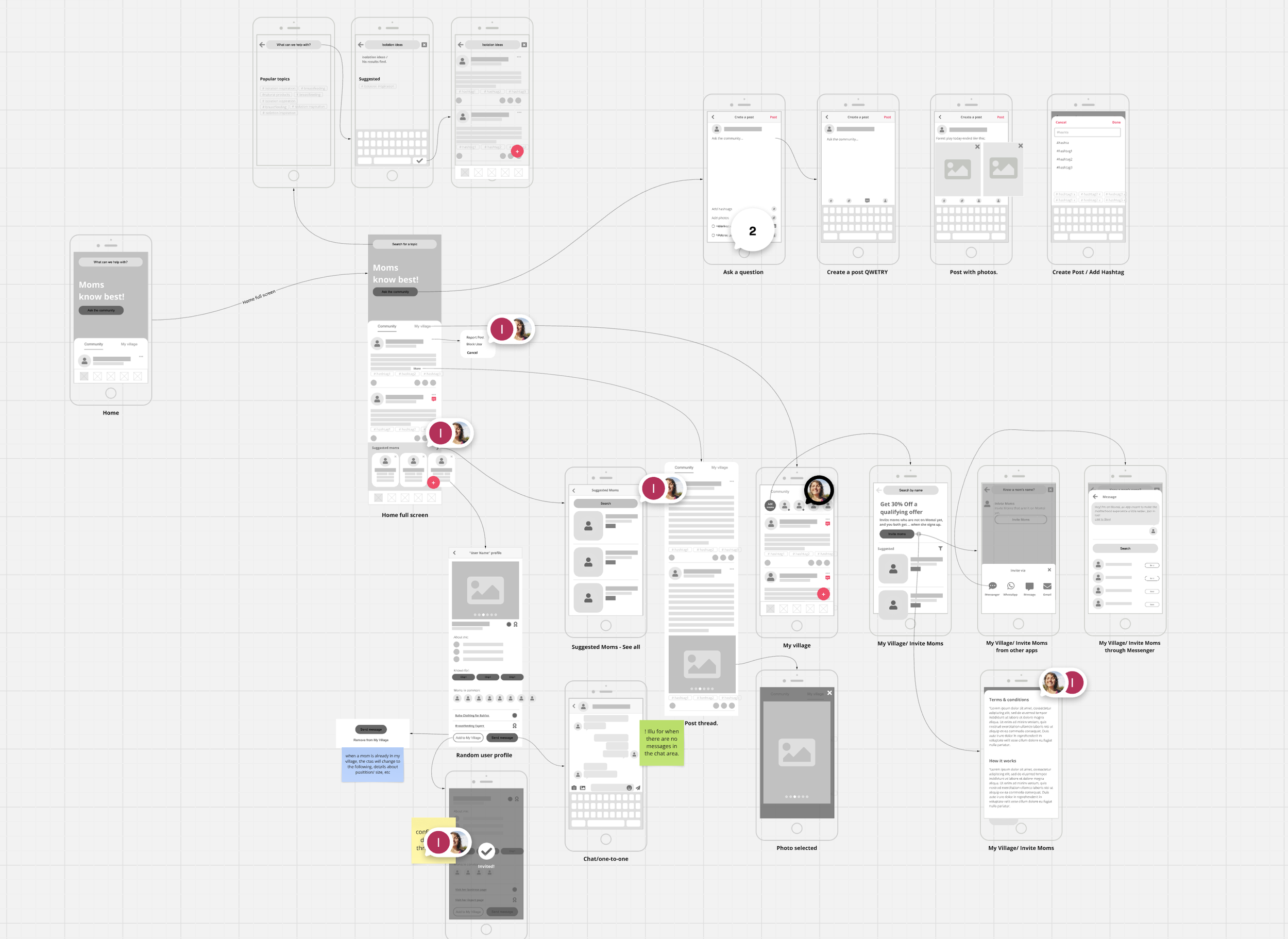
Community Flow
-
![]()
Meet-up Flow
-
![]()
Bazaar Flow
-
![]()
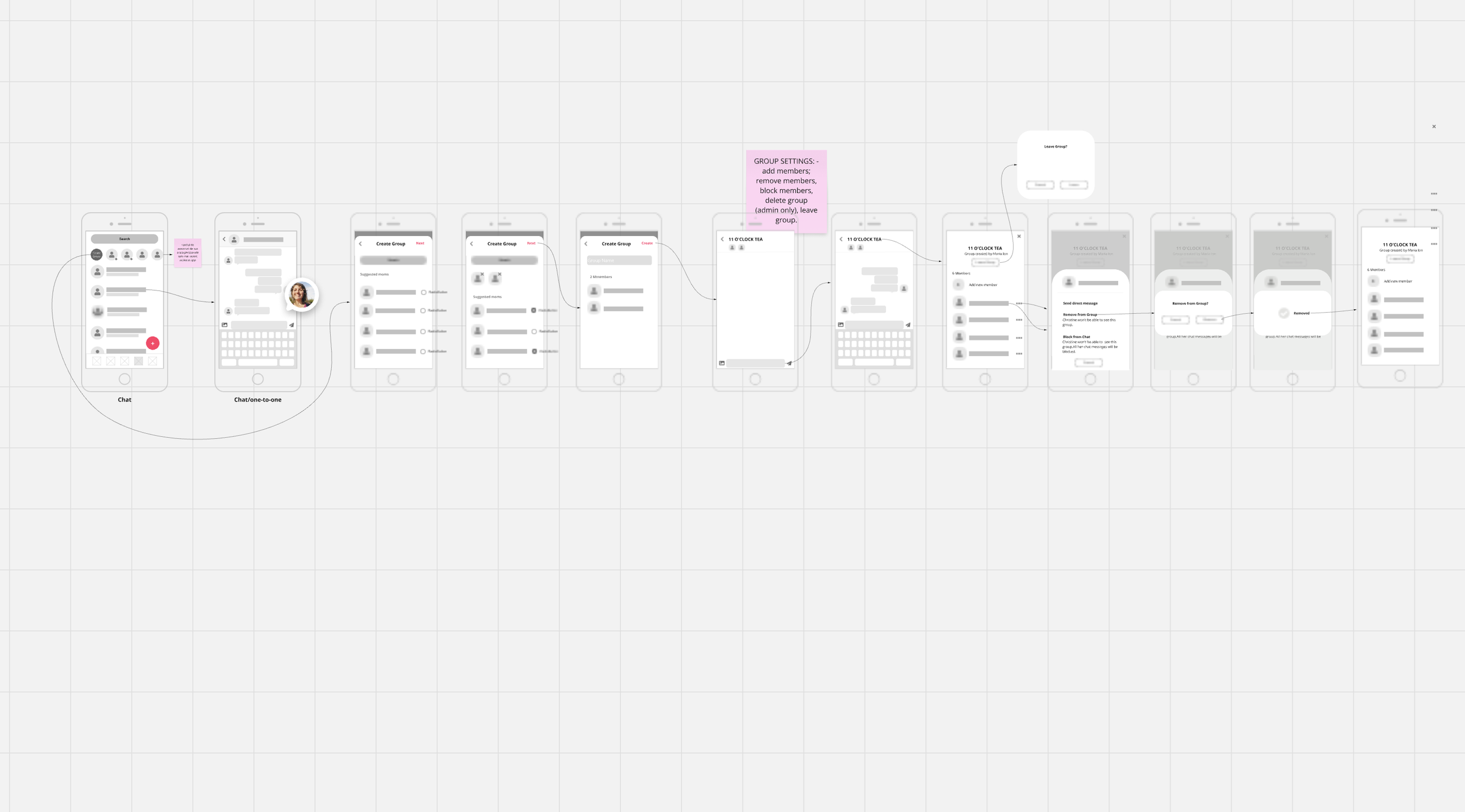
Chat Flow
-
![]()
My Account Flow
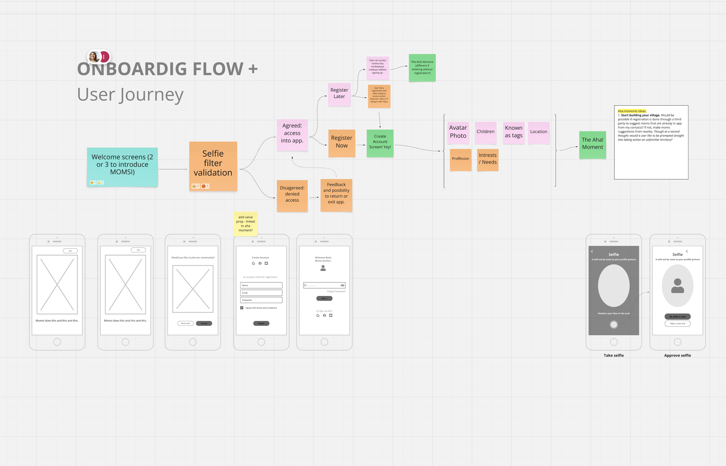


Onboarding and the AHA! Moment
The goal of onboarding was to collect enough meaningful information upfront to enable accurate, relevant matches between local moms. We also wanted to end the process with personalized suggestions—helping each mom discover nearby connections right away.
To enable rich, personalized matching and community building, we asked moms to share:
Location - Essential for surfacing nearby moms and local activities.
Children's details - Including age and gender, which helped tailor suggestions and conversations.
Fun, relatable personality tags – Tags like “Mom of Dragons”, “PhD in Patience”, or “Playground Medic” made the experience playful and allowed moms to express themselves quickly and delightfully.
Interests and needs – From “Everyday Support” to “Buy & Sell”, this helped us understand their priorities while creating smart filters for matching.
A women-only community: while we were pretty clear about introducing this step as a filter to only allow women in the app, we left it aside until we got the technical information from the development team.
We debated how much information to ask upfront, aware that long forms often lead to drop-off. But we found that by embedding humor, emotion, and visual play into the flow, we could ask for more without it feeling like more. Each screen was crafted to feel like a conversation, not a form.
-

Onboarding Step 1 - Prompting for identity information that is real (mandatory step).
-

Onboarding Step 2 - Asking for location information for matching with other local mums (mandatory step).
-

Onboarding Step 3 - Asking for Children Information for better matching with other mums with similar needs (optional step).
-
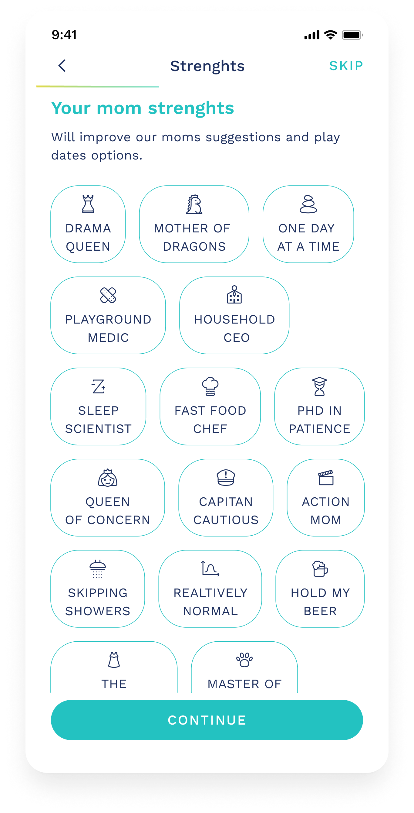
Onboarding Step 4 - Playful way to show their personality through choosing funny motherhood tags to display on their profiles (optional step).
-

Onboarding Step 5 - Asking for useful information to contour mums’ needs when joining the app.
-
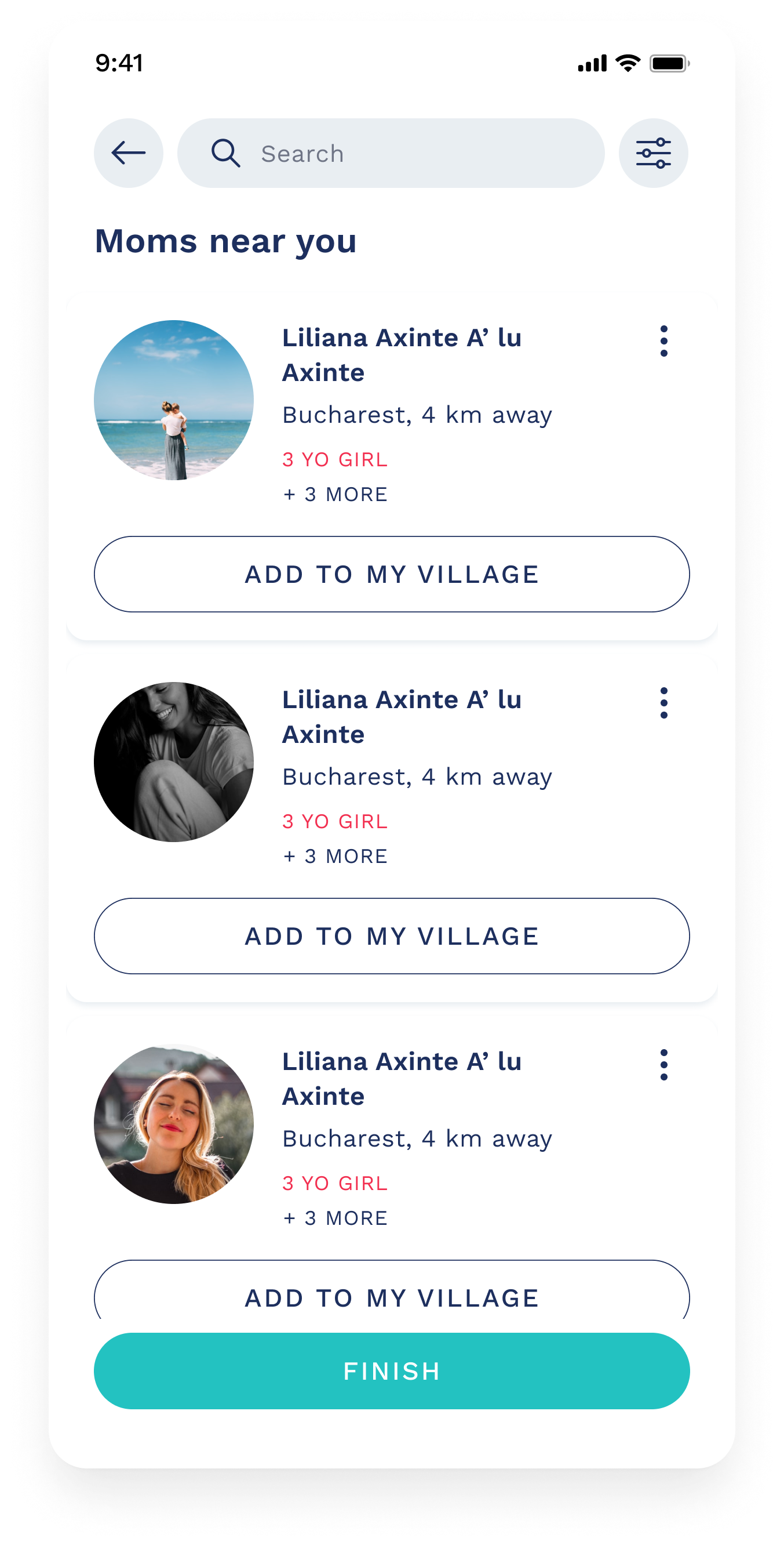
Onboarding Final Step: Aha! Moment - Mums are directed to a list of other local mums that they can be-friend.
Homescreen: A Place for Shared Experiences
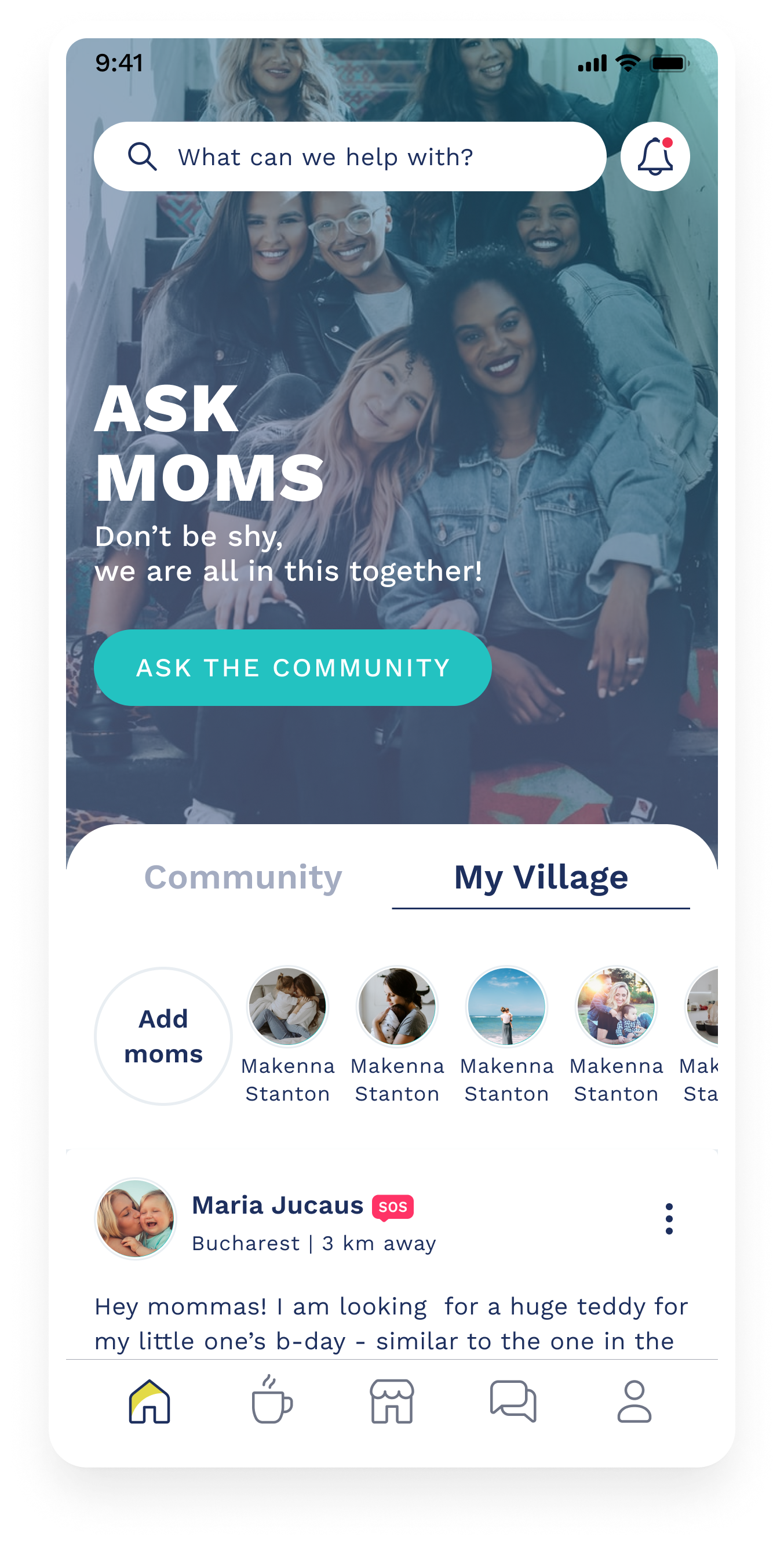
The home screen was designed to be the emotional and functional hub of the app, priming moms for a sense of community and support. We split the experience into two key tabs:
Community – A wider discussion forum to ask questions, share experiences, and support one another.
My Village – A more intimate, curated group of local or friend-moms that each user connects with.
Key Design Decisions:
Visual First Impression
We used a large, welcoming photo of mums together to set the tone for inclusion and warmth.
Default Tab: Community
We made Community the default open tab to surface fresh content and encourage interaction.
Emotional Support Through Quotes
We experimented with inserting rotating quotes about motherhood—light and relatable messages to normalize struggles and reduce stigma. These aimed to foster reassurance, especially for new moms.Anonymous Posting
To allow moms to share sensitive issues without fear of judgment, we included the option to post anonymously. Many users expressed a need for this to talk about things like postpartum anxiety, relationship struggles, or burnout.SOS Tag for Urgent Posts
We introduced an SOS tag for posts requiring urgent emotional or practical help. These posts were prioritized in the feed to draw attention quickly. While we were initially concerned about potential misuse, we decided to monitor behavior and respond accordingly if needed.Adding Local Moms to “My Village”
Through the Add Mom feature in the My Village tab, users could explore and connect with nearby moms. Filters supported relevance and personalization, allowing moms to build a local support network over time.
-

Homepage Community Tab - Meant to host and display the latest messages posted in the app.
-

We would insert playful and reassuring messages from time to time to create a feeling of inclusiveness (eg. - “No one knows what they’re doing… “).
-

When posting a message, multiple tools were available, like posting anonymously, tagging your post with an SOS label for increased visibility and adding hashtags.
-

Mums could use the search bar on the homescreen to look for specific topics.
-
“My Village” Tab would host messages posted by mums in ones village only.
-

One could check another mum’s profile and see if they have other mums in common - as an incentive to connect. The CTAs from Pofile would be to DM or to Add to My Village
Meet-ups: From Online to Real-Life Connections
The Meet-ups feature was designed to bring the community offline—giving moms a way to connect beyond chats and comments. We envisioned a space where real-life support networks could grow naturally, not just through formal events but through everyday meet-ups sparked by any mom in the village.
Most parenting meet-ups tend to be run by professionals or structured around formal topics. We wanted to break that mold. With Meet-ups, any mom can suggest a gathering, whether it’s a park playdate, a coffee catch-up, or a baby-friendly walk, and invite others to join.
Core Goals:
Empower moms to take initiative—not just join, but host.
Reduce friction around organizing: no complex signups, just a quick form and a link.
Flexible sharing: share with a few selected moms, invite all moms in the village or open the event to anyone using the app.
Just like with the Bazaar, we couldn’t build end-to-end event infrastructure (video and bookings) so instead, we focused on incentives and visibility. Meet-ups helped make connections feel accessible, casual and local, it gave mums a reason to come together.
-

The Meet-ups tab was designed to show upcoming local meet-ups. One could use the calendar feature to filter the events.
-

Mums could see details of a Meet-up, location, details, who else is coming, and confirm their participation.
-

Mums could save the meet-ups they were interested in and also RSVP if interested in participating.
-

We created simple steps for mums to create an host meet-ups. We wanted them to be percieved as opportunities to come together rather than formal occasions like webinars or workshops.
-

We have created some “types” of Meet-ups for virtual and in-person to help with easy labelling and set expectations when listed and seen by other mums.
-

To accomodate everyone’s needs, Meet-ups could be shared with other individual mums, with one’s Village or made public in the whole Community.
Bazaar: A Personal Marketplace
The Bazaar was designed as a marketplace where moms could buy, sell, and exchange gently used items—from baby clothes to toys and gear. The name “Bazaar” was intentionally chosen to evoke a sense of warmth, informality, and peer-to-peer connection—something more personal than a standard “marketplace.”
One of our biggest constraints was technical as we couldn’t build a full e-commerce infrastructure with payments and deliveries. Rather than compromise on a clunky or half-functional checkout experience, we leaned into the community ethos of the app. Our solution?
Let moms handle the transaction details.
Each listing featured a “Contact Mum” call-to-action. This opened a private 1-on-1 chat between buyer and seller, enabling them to arrange pickup, payment, or swap details on their own terms.
This decision aligned with our broader product values—encouraging trust, reducing friction, and enabling flexibility.
Key Features:
Clean, scrollable feed of items for sale, surfaced by relevance and location.
Search and filter to help moms quickly find what they need (e.g. toys, clothes, books).
Saved Items for favorites they might want to revisit.
Lightweight listing process to encourage participation and reduce cognitive load.
No-pressure selling: Moms could post used items knowing the app would not force prices or logistics.
We wanted the app to feel more like passing things along to someone who needed them, rather than doing business.
-

The Bazaar tab would host a list of items for sale or give away.
-

A mum could search for what she needed in the list.
-

Each listed product would have an individual page with extra photos and more details.
-

The CTA for Bazaar Items would be to contact the mum that has created the listing.
-

Mums could use the Chat feature to inquire about the listed items.
-

One could use their Profile page to edit all the Bazaar listings they have created.
Reflections
This project was a truly meaningful first experience—one I both enjoyed and deeply believed in. It felt incredibly rewarding to build something from scratch: defining the brand, articulating design decisions, collaborating closely with my team, testing with real users, creating a website to market the app (https://momsi.app/) and eventually handing off designs to a development team.
While I didn’t manage to complete every high-fidelity screen in time (still learning the ropes of time management!), I partnered with the in-house designer at the dev agency to ensure a smooth handoff. Together, we ran working sessions to align on component behaviour and layout rules.
It was a hands-on, collaborative transition, and it gave me a great understanding of how design becomes real in code.
I'm incredibly grateful to the team who trusted me with this but also to some external voices who have consistently supported and cheered for us, especially:
Iulia Jurca (Illustrator), for her thoughtful iconography and peer-to-peer support;
Alex Matei (Digitalya), for taking over my unfinished work and teaching me all the Figma tips;
Paulo Ertero (Dropbox), for his strategic mentoring and guidance;
Ioana Teleanu (UI Path), for her design review and cheerleading;
Our supportive group of mums who constantly helped us test, improve our work and believed in our idea of rebuilding the village.
Note: I used AI to help organise and polish the writing in this case study. The work, thinking, and decisions are entirely mine.