Improving Assignment Creation for Mental Health Practitioners
The Context
uMore initially launched as a self-care app, but user retention was low. People lacked motivation to return, wanted more personalized experiences, and craved human connection. This led us to create a stronger bridge between patients and therapists - allowing clients to continue their self-learning and growth while enabling therapists to monitor their patients outside of sessions through access to an electronic healthcare record platform (EHR).
However, we discovered that therapists not only wanted to track patient well-being but also needed a way to send their own personalized resources and assessments.
A key gap became clear: therapists lacked an easy way to provide personalized and engaging resources to their clients. This leads us to contour a new persona and narrow the scope of our product to focus solely on her needs.
The Opportunity
Help therapists deliver personalized support and track client progress between sessions without adding to their administrative burden.
The Team
Product Designer: Me (UX, UI, Research, Strategy)
Software Engineer: Boubaker Kalfat
Clinical Lead: Alejandro Saunders
CEO: Joel Stephano
New Product Direction
To launch a new MVP solution that helps therapists easily send personalised assignments and monitor client progress.

Why is it so challenging to deliver personalised homework?
I conducted both qualitative and quantitative research to better understand therapists' challenges in assigning and tracking client work. This involved talking to existing customers, as well as insights gathered from professional communities and forums.
My goal was to identify pain points in the assignment process and evaluate how existing solutions addressed—or failed to address—these needs.

Talking to Therapists:
Time-consuming assignment creation: Personalised tasks require too much effort.
Tracking difficulties: Forms were hard to manage - from client submission to storage and future reference.
Tech resistance: Therapists avoid introducing clients to complicated tools that require downloads and sign-ups
Communities and Forum Insights:
Reliance on pen and paper worksheets: therapists use photocopied worksheets from different intervention books
Lack of confidence for new therapists: finding the right tools for effective therapy.
Proof of progress: Therapists need evidence to show client improvement and meet insurance requirements.
Competition:
Quenza: Available ready-made resources, but time-consuming assignment creation and lacked progress monitoring.
Blueprint: Strong analytics, but uninspiring assignments.
Noble Health: Engaging content but relying on app download, limiting use to younger, tech-savvy clients.
Starting with Questions
Based on our research insights, we moved into the strategy phase by focusing on three key questions to guide our solution design:

How might we design a solution that enables therapists to create and send personalised assignments 10x faster than the industry standard?
Solution: Leverage ChatGPT by engineering prompts to generate high-quality, tailored assignments for clients quickly and efficiently.How might we design a solution for patients that is interactive and engaging?
Solution: Utilize SurveyJS library to transform AI-generated assignments into interactive forms where patients can actively input their responses, making assignments more dynamic and engaging.How might we simplify patient access to assignments?
Solution: Provide easy access via direct links shared through email and SMS, eliminating the need for login or app download.
Followed by More Questions…
With a clear strategy in place, I was ready to start designing — but first, I needed to answer a few key questions:
What’s the minimum functionality we need to test the experiment?
Solution: We're starting with just the basics, enough to see if the experiment is worth pursuing. This keeps things simple, helps us test key ideas with minimal effort, and makes scaling easier if things go well.Should we modify the existing EHR platform or build from scratch?
Solution: We'll build on top of the current product but hide any extra features for new customers. This keeps things quick without disrupting current users.Can we adjust the Survey JS UI to match our design system and ensure it’s responsive?
Solution: Survey JS isn’t fully customizable, but it does offer templates. We'll pick one that aligns with our design to keep things consistent.
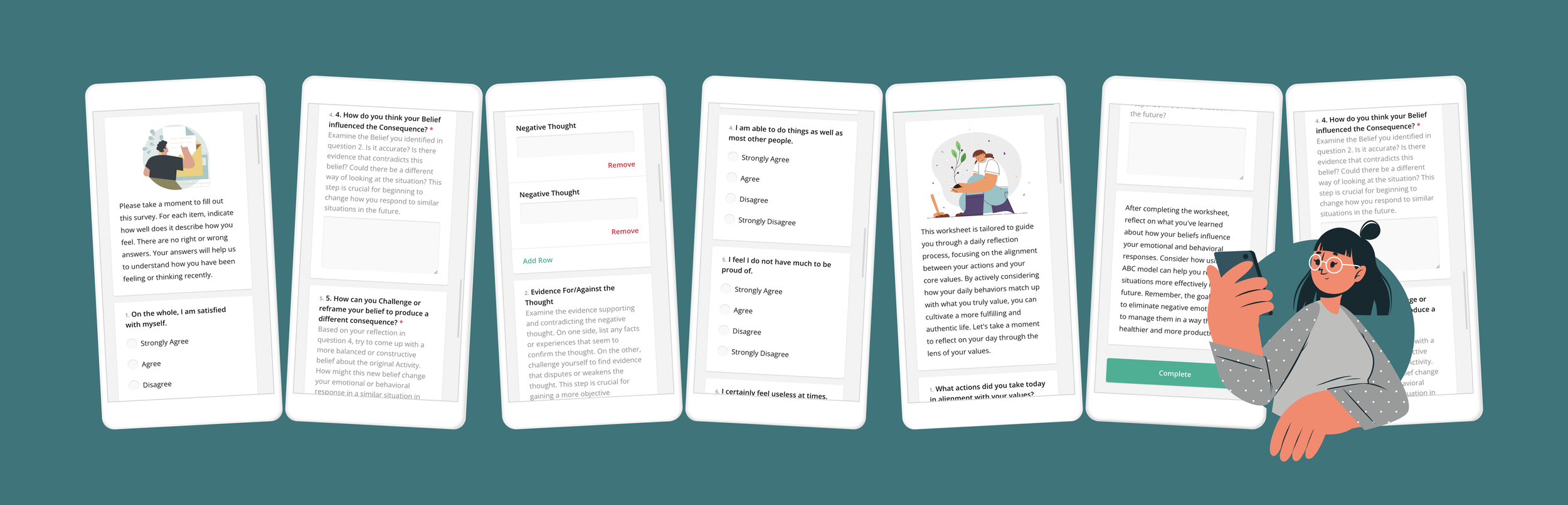
To gather feedback quickly, I created wireframes for the main user flows, focusing on layout, structure, and functionality. Along the way, I refined user stories, collaborated closely with developers to test Survey JS outputs, and worked with the clinical team to experiment with different ChatGPT prompts.
With these pieces in place, I was now ready to dive into the design phase.


The MVP
At this stage, I translated the wireframes into polished high-fidelity designs to bring the solution to life. Key design decisions include:
Minimal Designs: As we had a very small engineering team I had to consider minimal designs that require least implementation effort.
Self-Test Assignments: Nudge therapists to send assignments to themselves, allowing them to experience and evaluate the patient journey, as we have learnt in the past how important patient experience is for them.
Enhanced AI Output with Visual Elements: Incorporated imagery to make worksheets more engaging and approachable for patients, moving away from dull, text-only formats.
Launch & Optimisations
We have launched a successful marketing campaign and reached a stable conversion rate of around 3% which we considered a healthy and steady growth for our scope and industry.
We used VWO screen recordings to check for usability issues and gathered customer feedback.
We looked at the data to see what were the functionalities that were driving retention so we can improve those.


Mobile Responsiveness & Editor Assistant
Because most users were registering from Facebook Ads it increased traffic on mobile so we made sure to create a pleasant experience on mobile. Providing a seamless experience from the start was crucial for activation.
Also, the default Survey JS’s Editor mode was clumsy so we quickly implemented an AI editor to allow fast changes of the generated resources. This gave users the option to modify the worksheets with a prompt instead of time-consuming manual changes.


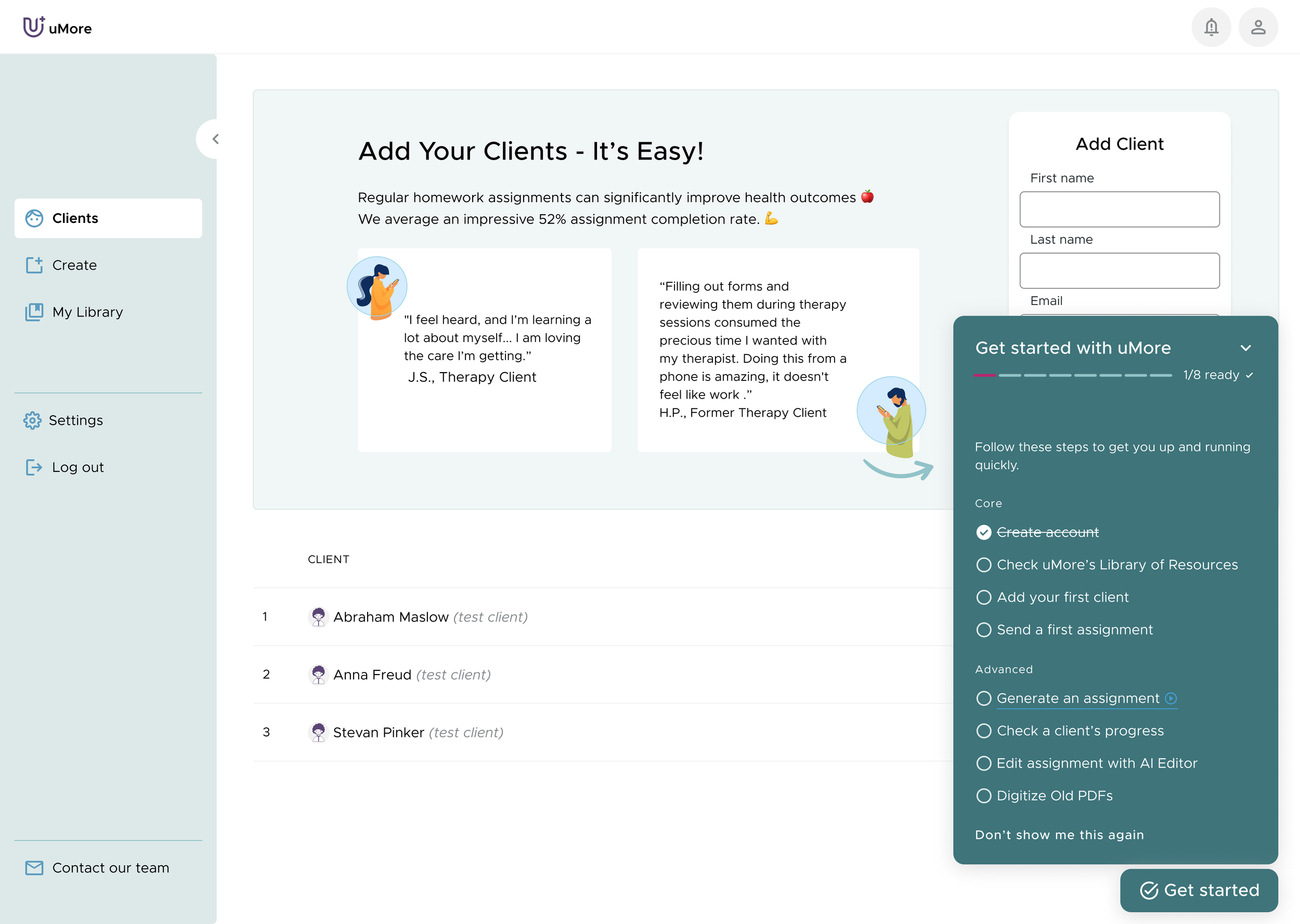
Improved Post-Activation Experience
To further support new users, we introduced a 'Get Started' guide and three test patients.
The “Get Started” guide provides clear steps to get up and running quickly, ensuring users can experience value from the platform without confusion.
Test patients allow users to explore features and understand the workflow and the value without before getting patient responses
Adding a patient was also a retention-driving feature, so we streamlined the process by requiring only essential information and ensuring the form was visible in the empty state of the client list.
We also noticed that therapists who regularly checked their patients' assignment results were the ones most likely to stick around. To encourage this, we improved the patient page design, making it easier to spot new activity at a glance.

Better Prompt Examples for the Generator
I noticed that therapists generally used 3-5 words when creating a generator prompt which resulted in a poor assignment outcome, so we added prompt suggestions to diminish the cognitive load of formulating a prompt from scratch.
Added Assessment Scoring
Initially, we relied on Chat Gpt to generate scoring for assessments but we thought it was important for transparency to allow therapists to verify and modify the scoring values. This also included sub-scales and the ability to measure multiple psychological constructs part of the same questionnaire.

Request for Additional Resources Types
As our user base started to increase, we had multiple voices requesting for new resources. So we have introduced multiple type of resources like treatment plans, intake forms and modules (therapy “paths” composed of multiple assignments). This added new challenges into how to fit in the content and how we personalise the generator prompt support to match the new resources.


We also got some amazing positive feedback :)
Challenges & Conclusions
Like most start-ups,the biggest challenge we faced was the lack of resources. Because of that, we had to keep tweaking our designs to make sure they were actually doable within the time and tech limits we had. It wasn’t always easy, but we stayed focused on making sure whatever we shipped still brought value to our users.
This project taught me the power of staying flexible and working closely with developers to figure out what’s possible. It wasn’t perfect, but those constraints pushed us to find smarter solutions—and in the end, we managed to offer a viable solution for many therapists in search of flexible homework for their patients.
Along the way, we were lucky to receive some valuable feedback—ideas and features that we couldn’t fit into the project’s scope. While we couldn’t build everything, we kept those insights in mind for future development.
Note: I used AI to help organise and polish the writing in this case study. The work, thinking, and decisions are entirely mine.